How I Redesigned Dell’s INC to Cut User Search Time by 40% and Simplify Enterprise Navigation
Dell’s Intelligence Nerve Center (INC)—a key platform for 30K+ employees—was plagued by fragmented UX. Cluttered navigation and missing guidance caused cognitive overload, doubling task times and slowing operations. As lead designer, I rearchitected INC’s IA to streamline workflows and accelerate task completion
90%
User satisfaction rate
40%
Increase in infromation findability
20%
Increase in adoption rate
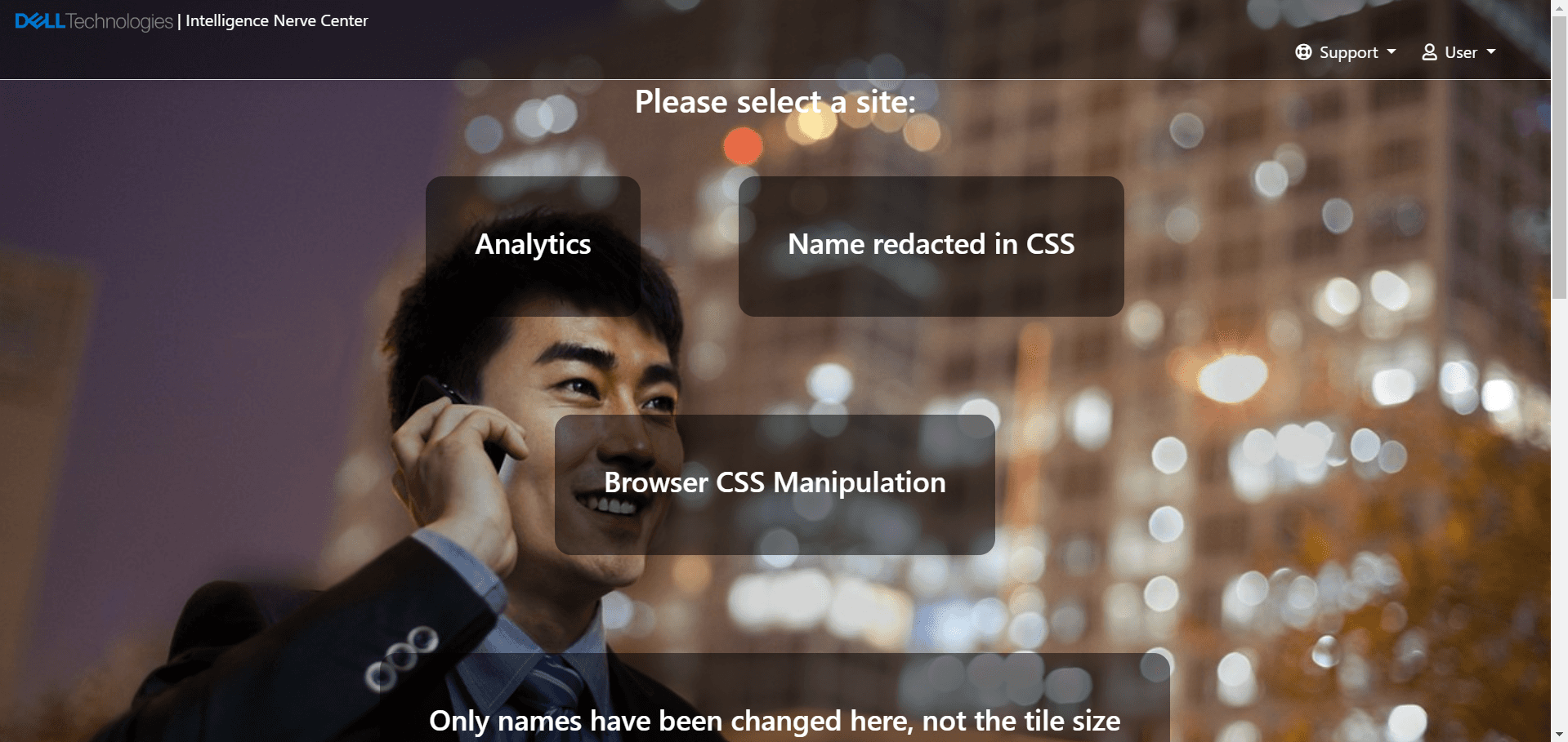
Details, such as names, workflows, and interfaces, , have been modified to maintain confidentiality
What is INC
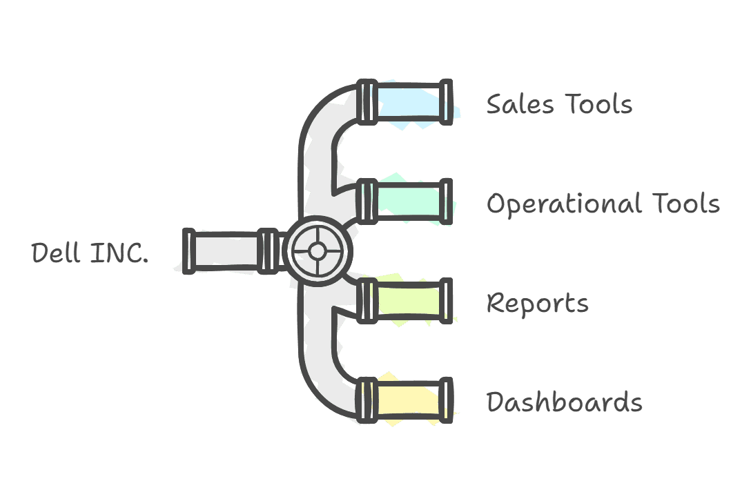
Dell INC. is an internal website utilized by over 30,000 Dell employees worldwide. It is a centralized hub for various sales and operational tools, reports, and dashboards. This platform is essential for employees across different departments to access and analyze critical data, generate reports, and make informed decisions. From sales representatives tracking performance metrics to supply chain managers monitoring inventory levels, Dell Inc. supports a wide range of business functions.
What's the ask?
I was tasked with completing a comprehensive redesign of the Dell Inc. website as the sole UX designer. The goal of the revamp was to modernize the website's look and feel, ensure its scalability to accommodate future growth, and most importantly, improve the user experience by making it easier for employees to access the tools and reports they need on a daily basis.
Business Goals
🎨 Revamp the website
📈 Need to be scalable
💙 Adhere to Dell branding
✋ Fix usability issues
➕/➖ Add/remove business suggested features
To know more about my
Problem
Dell employees need/want quick access to essential tools, reports, and dashboards because they rely on these resources to do their jobs effectively. Still, the current INC platform requires excessive clicks to navigate to these resources. This makes them feel frustrated and unproductive.
“The number of clicks needed to reach the report slows me down. It disrupts my workflow and feels inefficient, even though I'm familiar with the site.“
— Matt , Data Engineer
Dell employees need/want quick access to essential tools, reports, and dashboards because they rely on these resources to do their jobs effectively. Still, the current INC platform requires excessive clicks to navigate to these resources. This makes them feel frustrated and unproductive.
Solution
Streamlining Report Access: A Three-Pronged Approach
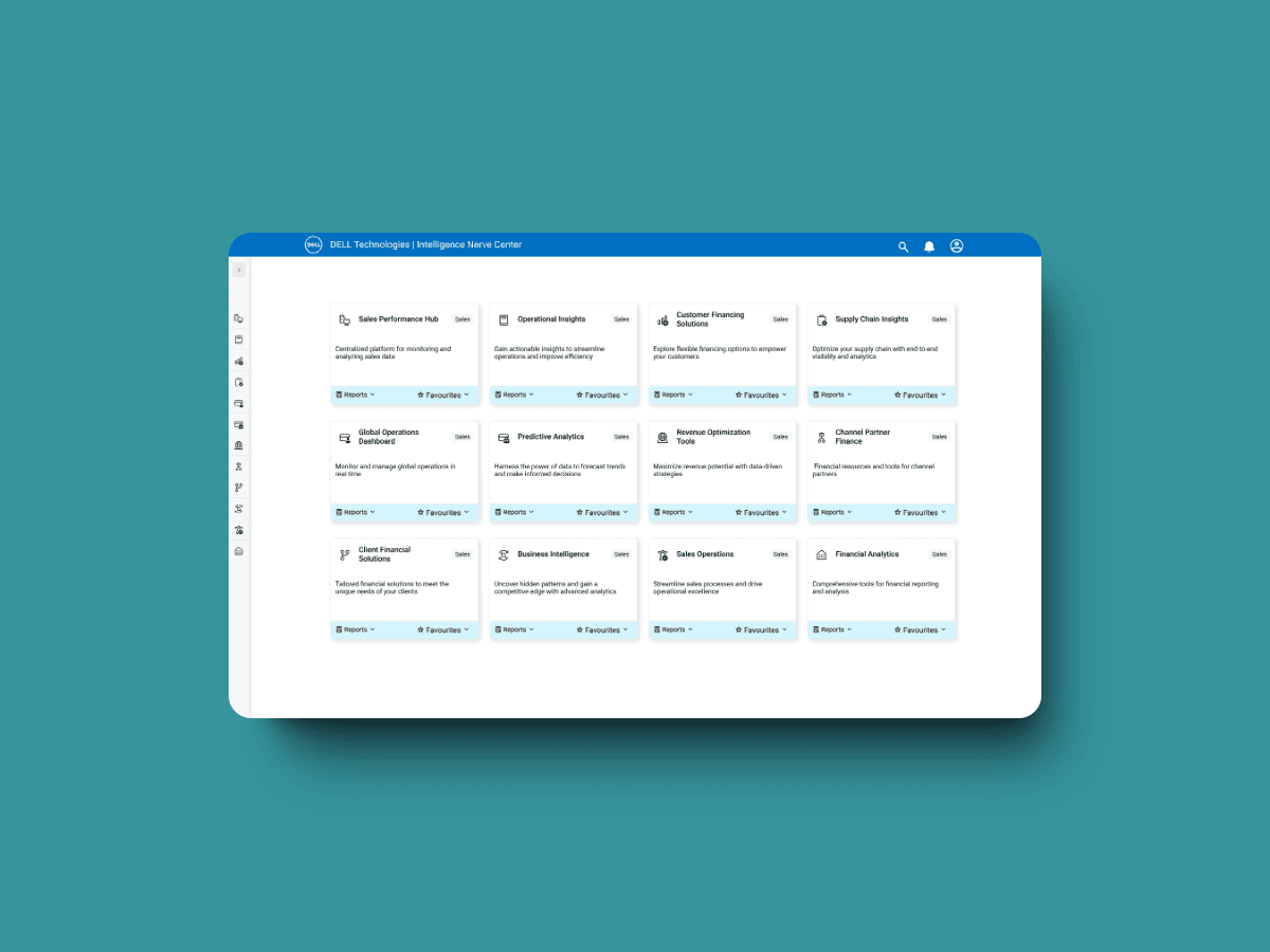
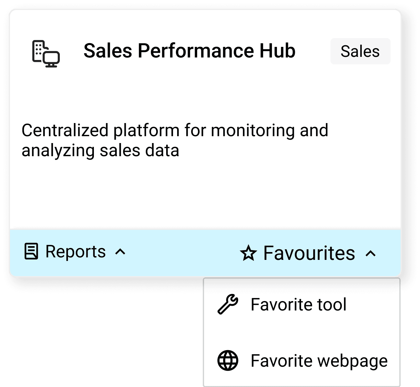
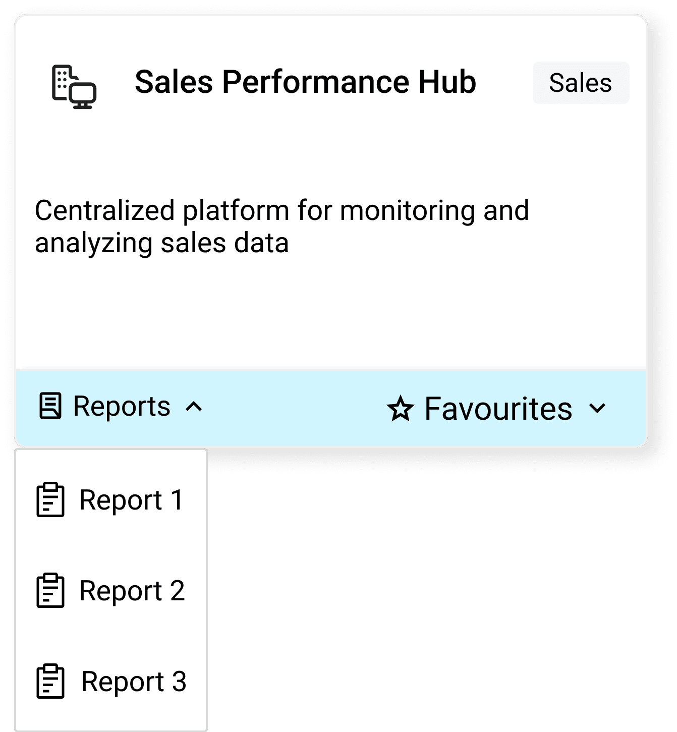
Favorites Integration
I integrated a "Favorites" feature directly into the home screen tiles. This allows users to mark frequently accessed reports as favorites, granting them one-click access from the most convenient locations. This solution significantly improves workflow efficiency by reducing the steps required to reach critical information.
Dell employees need/want quick access to essential tools, reports, and dashboards because they rely on these resources to do their jobs effectively. Still, the current INC platform requires excessive clicks to navigate to these resources. This makes them feel frustrated and unproductive.
Reports Dropdown Enhancement
In addition to the Favorites feature, I enhanced the reports dropdown menu within the tile. This allows users to directly access any report from the home screen without navigating to a separate reports page. This streamlined access point saves valuable time and reduces the number of clicks required for report retrieval.
Dell employees need/want quick access to essential tools, reports, and dashboards because they rely on these resources to do their jobs effectively. Still, the current INC platform requires excessive clicks to navigate to these resources. This makes them feel frustrated and unproductive.
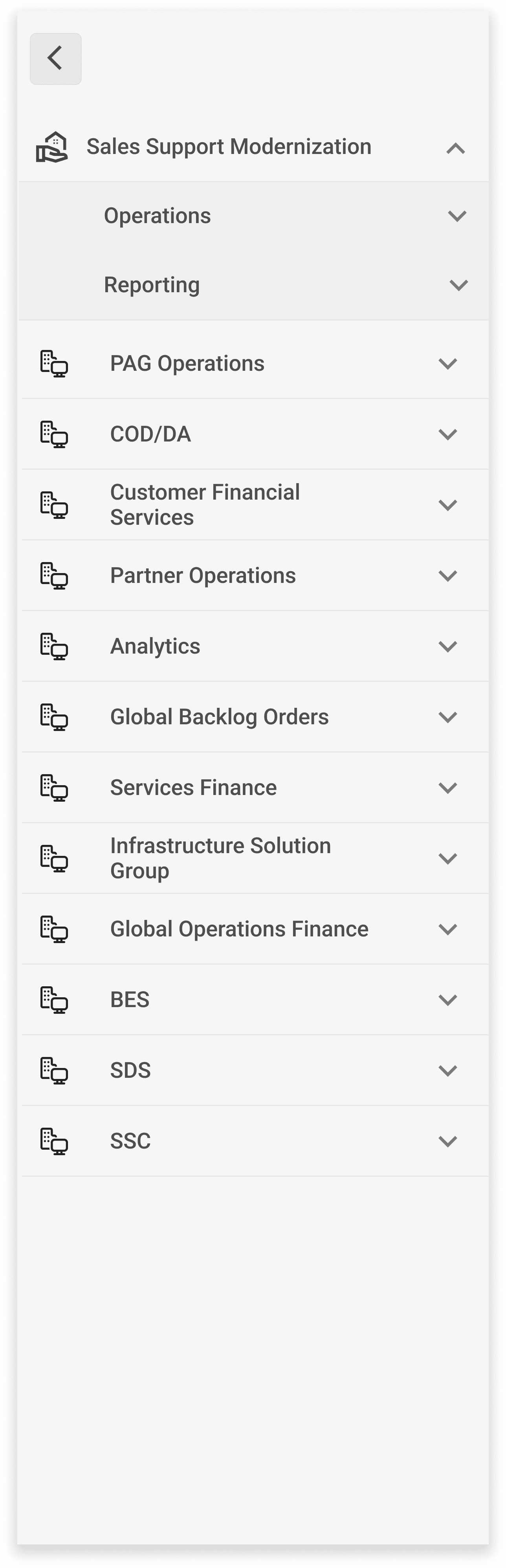
Universal Side Navigation:
To further enhance navigation throughout the website, I added a persistent side navigation bar. This gives users a quick and consistent way to jump to any page, regardless of their location. By offering a global navigation tool, this solution eliminates the need for backtracking or navigating through multiple levels of menus.

Dell employees need/want quick access to essential tools, reports, and dashboards because they rely on these resources to do their jobs effectively. Still, the current INC platform requires excessive clicks to navigate to these resources. This makes them feel frustrated and unproductive.
Problem 2
Dell employees need/want a modern, visually appealing, and easy-to-navigate platform because they expect a user experience that reflects Dell's innovative brand, but the outdated INC design, with its confusing layout and distracting elements, creates a negative perception and hinders their ability to find information quickly. This makes them feel disengaged and underwhelmed. Still, the
“This UI needs a modern refresh that reflects our brand and showcases our capabilities, with intuitive navigation that can grow with us.”
— Gayathri, Director
Dell employees need/want quick access to essential tools, reports, and dashboards because they rely on these resources to do their jobs effectively. Still, the current INC platform requires excessive clicks to navigate to these resources. This makes them feel frustrated and unproductive.
Solution
Enhancing User Experience Through Visual Design
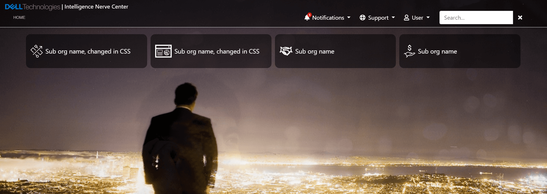
Background Removal:
I removed the image-based background from the website to reduce visual clutter and improve readability. Background images can often compete with foreground content, making it difficult for users to focus on essential information. The content becomes the primary focus by opting for a clean, neutral background, enhancing overall clarity.

Dell employees need/want quick access to essential tools, reports, and dashboards because they rely on these resources to do their jobs effectively. Still, the current INC platform requires excessive clicks to navigate to these resources. This makes them feel frustrated and unproductive.
Color-Coded Tiles with Visual Cues:
I replaced the previous layout with a tile-based organization system. Each sub-organization is represented by a uniquely colored tile, creating a clear visual distinction. Furthermore, I incorporated visual cues within each tile, such as icons or symbols, to provide users with additional context and aid in identifying their location within the website's hierarchy. This intuitive system lets users quickly and easily navigate the relevant sections.

Dell employees need/want quick access to essential tools, reports, and dashboards because they rely on these resources to do their jobs effectively. Still, the current INC platform requires excessive clicks to navigate to these resources. This makes them feel frustrated and unproductive.
Key outcomes
90%
User satisfaction rate
40%
Improved Information Findability
20%
Increase in adoption rate
50%
reduction in misclicks
To know more about my..
📊 Data-Driven Decisions: Discover how usability testing shaped the final design.
🔄 Iterative Refinement: See how feedback led to continuous improvements.
📈 Success Metrics: Uncover the specific metrics used to measure the redesign's impact.