How I Transformed Qualitative Insights into Actionable Design Solutions, Resulting in a 50% Increase in User Satisfaction
The Dell Intelligence Nerve Center (INC), a crucial internal website used by over 30,000 employees, suffered from significant usability issues. The platform's cluttered interface, complex navigation, and lack of contextual cues frustrated users across various departments, hindering their ability to access vital tools, reports, and dashboards efficiently. This resulted in decreased productivity, increased time spent searching for information, and potential delays in decision-making, ultimately impacting the organization's overall efficiency and performance.
3
Research Methods
10+
Key Insights
2
Root causes
Details, such as names, workflows, and interfaces, , have been modified to maintain confidentiality
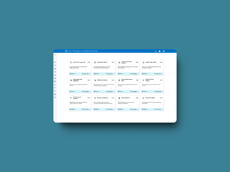
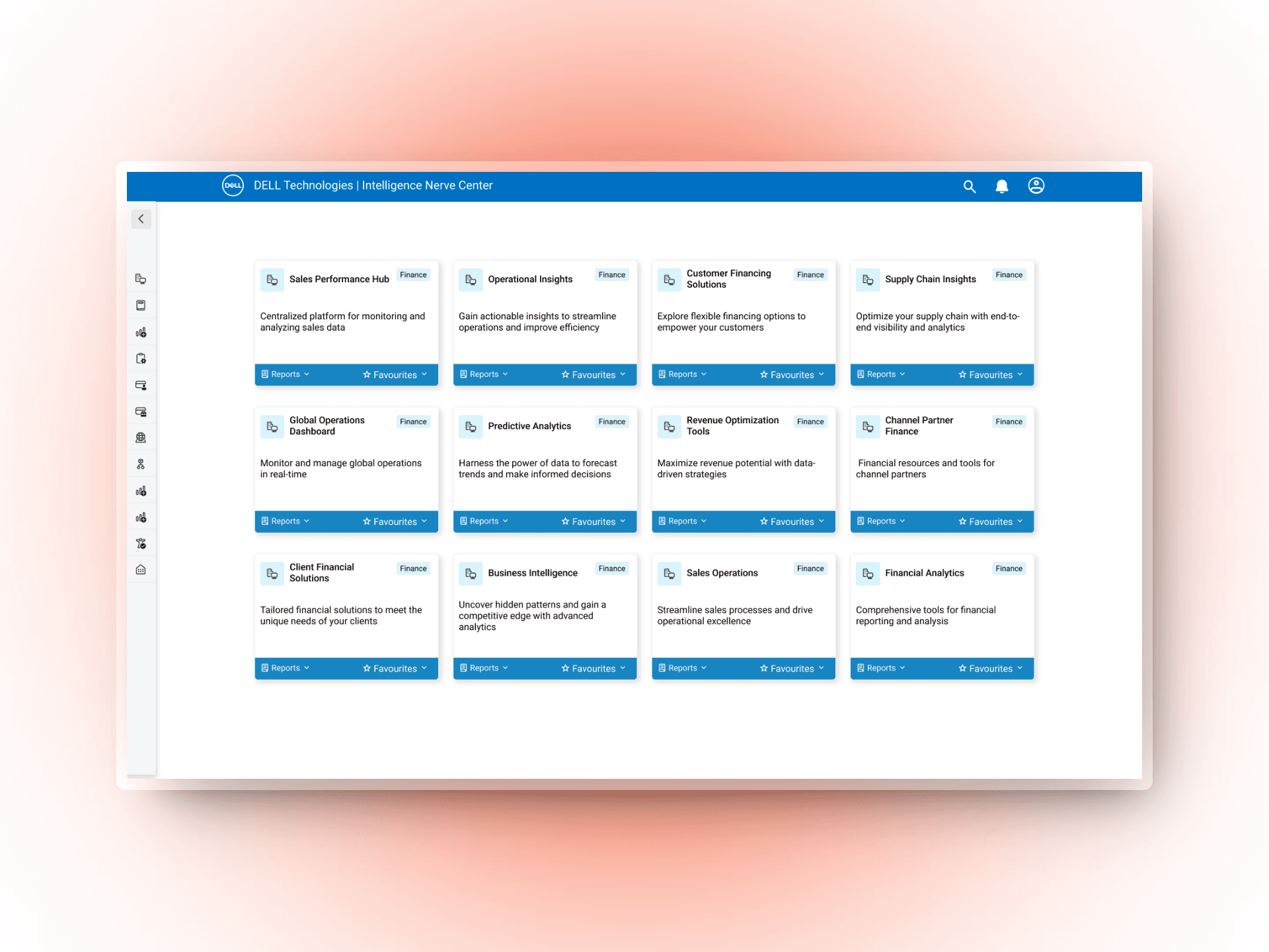
What is INC
Dell INC. is an internal website utilized by over 30,000 Dell employees worldwide. It is a centralized hub for various sales and operational tools, reports, and dashboards. This platform is essential for employees across different departments to access and analyze critical data, generate reports, and make informed decisions. From sales representatives tracking performance metrics to supply chain managers monitoring inventory levels, Dell Inc. supports a wide range of business functions.
What's the ask?
I was tasked with completing a comprehensive redesign of the Dell Inc. website as the sole UX designer. The goal of the revamp was to modernize the website's look and feel, ensure its scalability to accommodate future growth, and most importantly, improve the user experience by making it easier for employees to access the tools and reports they need on a daily basis.
Business Goals
🎨 Revamp the website
📈 Need to be scalable
💙 Adhere to Dell branding
✋ Fix usability issues
➕/➖ Add/remove business suggested features
My Priorities
✅ Fulfill business goals
🎯 Find and solve pain points
🔍 Identify user needs and frustrations
✨ Enhance the overall user experience
Research
User Interview - Qualitative Method
"Honestly, it's like finding a needle in a haystack trying to find the right report. It's beyond frustrating."
To gain a deeper understanding of user needs and frustrations, I conducted in-depth interviews with 9 individuals representing different roles and levels of experience within the organization. These interviews allowed me to gather qualitative data on their specific pain points, desired features, and overall perceptions of the Intelligence Nerve Center (INC).
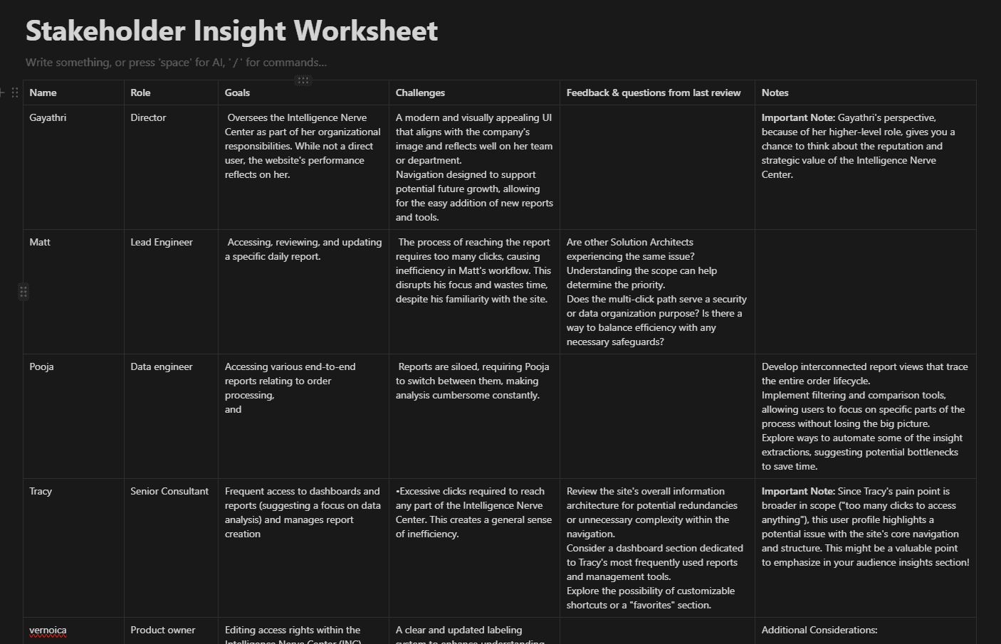
😖 Information Overload
Users felt overwhelmed by the sheer volume of information and lack of clear organization
🔍 Difficulty Finding Information
Navigating the platform to locate specific reports or tools was a major pain point
낡 Outdated Design
The visual design was perceived as outdated and unappealing, creating a negative user experience
⚙️ Limited Customization
Users desired more personalized dashboards and views tailored to their roles
Contextual Inquiry - Qualitative Method
Observing Users In Their Natural Habitat Exposed Inefficiency
In addition to interviews, I conducted contextual inquiries, observing users as they interacted with the INC in their natural work environments. This allowed me to gain valuable insights into their actual workflows, identify specific areas of friction, and understand how the platform's design was impacting their productivity.
Key insights from Contextual Inquiry
🧭 Inefficient Workflows
Users had to navigate through multiple clicks and detours to complete common tasks
🚧 Reliance on Workarounds
Users created their own solutions to bypass the platform's limitations
🤷 Lack of Contextual Relevance
The information presented wasn't always relevant to the user's role or task
Survey - Quantitative Method
User Feedback Unveils Critical Usability Gaps in Current Platform
Following the qualitative research phase, we conducted a quantitative survey to gather broader feedback from thousands of INC users. This allowed us to validate and prioritize the initial findings, as well as uncover additional pain points that were more prevalent at scale.
Key insights from survey
🏷️ Outdated Labels:
A significant portion of users found the labels for various tools and reports to be confusing or outdated
📑 Duplicate Content
The survey confirmed the presence of duplicate or redundant reports and tools, causing unnecessary confusion
⏳ Slow Loading Times
Users are frustraed with the slow loading times of certain pages and reports, impacting their productivity
📊 Limited Analytics Capabilities
Several users reported that the available analytics tools were insufficient for their needs
Deciding the Path Forward: Prioritizing User Needs with a Data-Driven Approach
Ishikawa Diagram
Prioritization matrix
Through Ishikawa Diagram and prioritization matrix, two primary pain points emerged as the root causes for the majority of user frustrations that I wanted to focus on
Click Fatigue: The excessive number of clicks required to navigate and access information within the INC led to a cumbersome and time-consuming user experience.
Visual Dissonance: The outdated visual design, lack of clear hierarchy, and inconsistent layout contributed to a sense of disorientation and difficulty finding relevant information.
These two problems became the focal points for the redesign efforts, guiding the development of solutions aimed at simplifying navigation, reducing clicks, and enhancing the overall visual appeal and usability of the platform.


Data-Driven Decisions: Balancing User Needs with Business Expectations
By tackling these two core problems, the redesign not only improves the day-to-day experience for thousands of Dell employees but also contributes to a more efficient, engaged, and satisfied workforce, ultimately benefiting the company's bottom line
From Insights to Action
Research-Driven Design
Iterative Prototyping
Data-Informed Refinement
User Testing Validation
Guided by user research insights, initial design concepts were rapidly iterated into interactive prototypes. These prototypes were then tested with a moderated group of users, gathering valuable feedback on usability, navigation, and overall experience. Based on the findings, iterative refinements were made to the design, addressing pain points and enhancing the user interface. This cyclical process of testing and refining ensured the final design effectively addressed user needs and aligned with business goals.
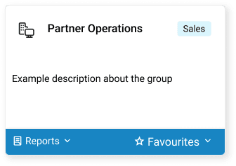
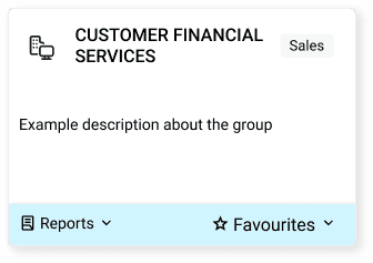
Prioritizing Accessibility: Addressing a Contrast Issue During Design
Contrast Checks
Keyboard Navigation
Screen Reader Compatibility
Data-Informed Refinement
During these accessibility checks, I discovered that the blue color used in the card's footer failed the contrast test, particularly for low-vision users. While this blue aligned with Dell's brand palette, prioritizing accessibility was paramount. I quickly identified alternative shades of blue that maintained brand consistency while meeting WCAG contrast requirements, ensuring an inclusive user experience.
Hover over the cards below
Evaluation Metrics
90% User Satisfaction Rate
Post-launch surveys
Feedback mechanism
System Usability Scale (SUS) questionnaires and Net Promoter Score (NPS) surveys were administered to gather quantitative data on user satisfaction. Open-ended feedback was also collected to understand qualitative aspects of user experience.
40% Improved findability
A/B testing
task-based usability testing
Different navigation structures and search functionalities were tested with users to determine which options resulted in faster and more successful completion of information-finding tasks
20% Increase in Adoption Rate
Analytics
longitudinal user studies
Web analytics tools tracked the number of unique users and sessions, comparing pre- and post-launch data to assess the increase in platform usage. Longitudinal studies followed a cohort of users over time to observe changes in their engagement with the platform
50% Reduction in Misclicks
Click heatmaps
task-based usability testing
Click heatmaps were used to visualize where users were clicking on each page, highlighting areas of confusion or misdirection. Task-based usability testing allowed for direct observation of user behavior, identifying specific instances of misclicks and their causes